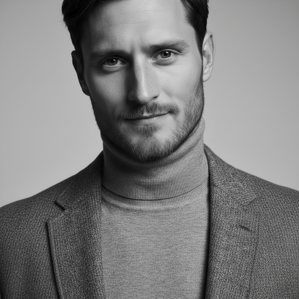
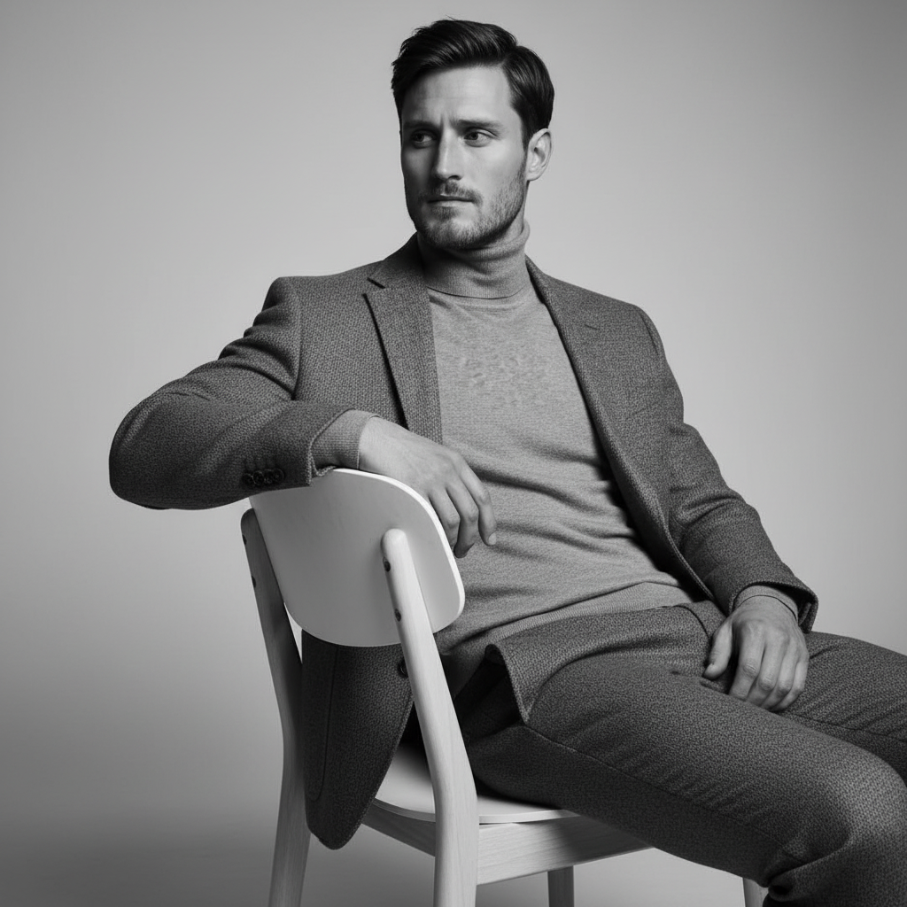
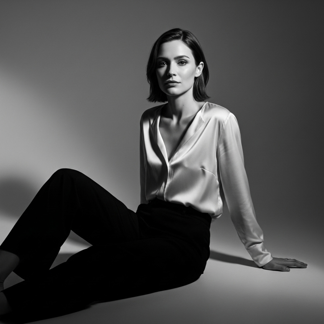
Almost monochrome but not quite. The restraint that makes every other element stronger.
Desaturated portraits operate in the space between full colour and black and white. Colour is present but heavily reduced, creating a quality that reads as analogue, considered, and contemporary. It is the aesthetic of serious fashion photography and art-house cinema, where restraint is itself a statement.
Why it works
For photographers, artists, and creatives in the fashion and editorial space, the desaturated aesthetic signals taste and restraint. It reads as a deliberate, expert choice rather than a colour deficiency. In an era of over-saturated social media imagery, desaturation is a form of visual confidence.
What the output looks like
Desaturated portraits require a targeted approach to saturation reduction that preserves luminance contrast while flattening chroma. ThePortraitOS applies global desaturation with skin-tone channel protection, keeping skin readable as warm and human even at overall saturation levels below 30% of standard.
What the output looks like
The portrait shows near-monochrome tones with sufficient residual colour to distinguish skin from background. The overall quality reads as analogue and considered. Nothing is accidental.
Common questions
Desaturated is more extreme than muted palette. Muted palette retains more colour at a quiet level. Desaturated pushes toward monochrome while retaining just enough colour to not be classified as black and white.
Yes, in creative contexts. For traditional corporate environments, the style may appear unusual. For design, fashion, photography, and art direction roles, it signals strong aesthetic judgement.
Yes, and it is a powerful combination. Cinematic lighting with desaturated colour produces a result with strong form definition and maximum restraint in colour, similar to a high-end fashion campaign.
Start now
20 portraits for $29, one-time. Credits never expire. Your identity model is stored permanently so you can generate new portraits at any time.