Generated with ThePortraitOS — 8K resolution, studio Rembrandt lighting.
What you wear in a headshot shapes the entire impression before anyone processes your face or expression. The goal is not to look your most dressed-up — it is to look like the best version of yourself in a professional context.
Headshot attire advice tends toward extremes: either overly formal ('wear a suit') or dismissively vague ('just look professional'). Neither is useful. What you wear affects the overall impression of the headshot at multiple levels: the colour shapes contrast with your skin tone and background; the fabric affects how light interacts with the outfit; the neckline frames your face. These are technical variables with consistent research-backed answers, not matters of pure preference. This guide covers what works photographically across genders, industries, and skin tones — and what consistently produces poor results.
Generated with ThePortraitOS — 8K resolution, studio Rembrandt lighting.
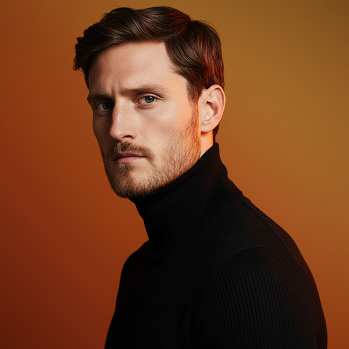
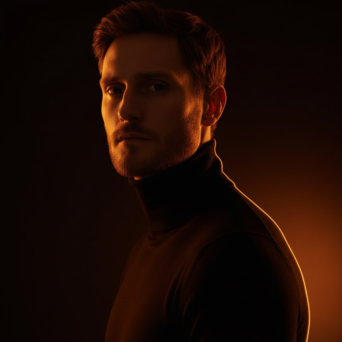
The most reliable colours for headshot attire are muted, non-competing tones that provide contrast with the background without distracting from the face. Navy blue is the single most reliably flattering colour for headshots — it photographs extremely well, reads as professional in virtually every industry, and flatters most skin tones. Deep grey, forest green, burgundy, and warm brown also photograph well. These medium-saturated colours provide visual interest without competing with the face. Avoid: bright white (creates harsh contrast and visual blooming), neon or highly saturated colours (dominate the frame), black (can flatten in low-contrast backgrounds), very pale skin tones against very pale backgrounds (face disappears), and red (photographs loudly, difficult to balance).
Avoid patterns at all costs for headshots. Fine stripes, herringbone, houndstooth, and checks create a moiré effect in photographs — a distracting visual interference pattern caused by the digital sensor interacting with the regular pattern of the fabric. Even patterns that look subtle in person create visual noise in photos. Solid fabrics in the colours above are correct. Regarding fabric: matte fabrics photograph better than shiny ones. Silk, satin, and some polyester blends create highlights that compete with the face and look cheap in photographs, even if the fabric is expensive in real life. Matte cotton, linen, cashmere, and wool all photograph cleanly.
For most industries: a well-fitted collared shirt (button-down or polo) in a solid muted colour, with or without a jacket. The jacket is not necessary but adds formality if the role demands it. The shirt should be fitted rather than loose — visible fabric bulk at the shoulders and chest creates visual noise. A tie is appropriate only if the industry explicitly requires formal attire (finance, law, some corporate roles). For creative industries: a smart casual shirt without a jacket reads as more authentic. The key variables: fit (well-fitted always outperforms baggy), colour (navy, grey, forest green), and collar (a shirt collar frames the face and neck clearly; crewnecks hide the transition from face to clothing).
For most industries: a solid-colour blouse, blazer, or fitted top with a neckline that frames the face clearly. V-necks and scoop necks draw the eye upward toward the face; high necks and turtlenecks can shorten the visible neck. Avoid very low necklines, which can look informal in professional contexts, and very high necklines, which read as stiff. Blazers photograph consistently well — they frame the shoulder line and read as professional across industries. Jewellery: small, simple pieces that don't catch light or create visual noise. Large statement necklaces compete with the face; dangling earrings can distract. Makeup should appear natural in the photograph — matte foundation photographs better than dewy formulas, which can create shiny patches.
Corporate/finance/legal: formal attire is appropriate — collared shirt or blouse, jacket or blazer, conservative colours. Technology/startups: smart casual is the standard — a well-fitted shirt or top, no tie, jacket optional. Creative fields: more latitude — but still avoid anything that competes with your face. Healthcare/academia: business casual with conservative colours. The general principle: dress one level above what you wear on a normal working day. If you work in jeans and a t-shirt, wear chinos and a collared shirt. If you wear business casual, wear a blazer. Looking slightly more polished than usual is the target.
Common questions
Black is possible but risky. Against a dark background, it creates low contrast and the outfit effectively disappears. Against a light background it works better. Navy is almost always a better choice than black for headshots — it reads as equally professional but photographs with more visual definition.
Only if a tie is appropriate for your professional context. For most technology, creative, consulting, and startup environments, a tie reads as overly formal. For finance, law, and traditional corporate roles, a tie is standard. When in doubt, err on the side of slightly more formal — you can always change your LinkedIn photo later.
Patterned fabrics (moiré effect), bright white (blooms and creates harsh contrast), neon colours (dominate the frame), shiny fabrics (create highlights that compete with the face), very casual clothing (t-shirts, hoodies), and anything that distracts from the face. Logos and branded clothing should also be avoided.
With AI generators like ThePortraitOS, attire in your source selfie is used as a reference for expression and facial features — but the AI applies professional attire appropriate to the context you select. You can specify the style (business formal, smart casual, creative professional) and the AI renders appropriate clothing. Your selfie attire is less critical than for traditional photography.
Start now
ThePortraitOS generates your headshot with professional attire applied by AI. Select the style — business formal, smart casual, creative — and the AI handles the rest. First portrait free.