Generated with ThePortraitOS — 8K resolution, studio Rembrandt lighting.
Your headshot background isn't just a backdrop — it shapes contrast, attention, and professional impression. The wrong background actively hurts the headshot; the right one disappears and lets your face do the work.
Most people treat the background of a headshot as an afterthought — whatever wall or space is available when the photo is taken. This is a mistake. Background choice directly affects three things that determine headshot effectiveness: contrast (whether your face separates clearly from the background), attention (whether the background competes with your face for viewer focus), and professional impression (what the background environment communicates about the context). This guide covers every background option — from solid studio colours to environmental backgrounds — with specific guidance on what works and why.
Generated with ThePortraitOS — 8K resolution, studio Rembrandt lighting.
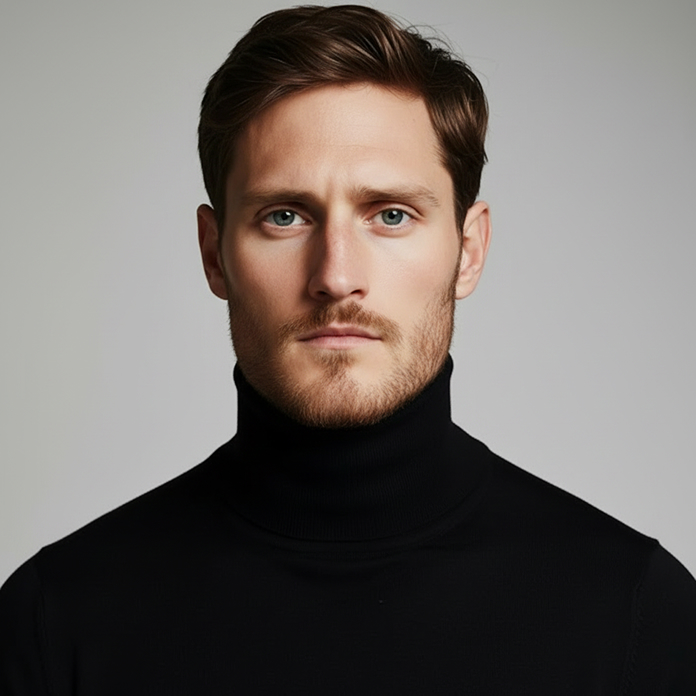
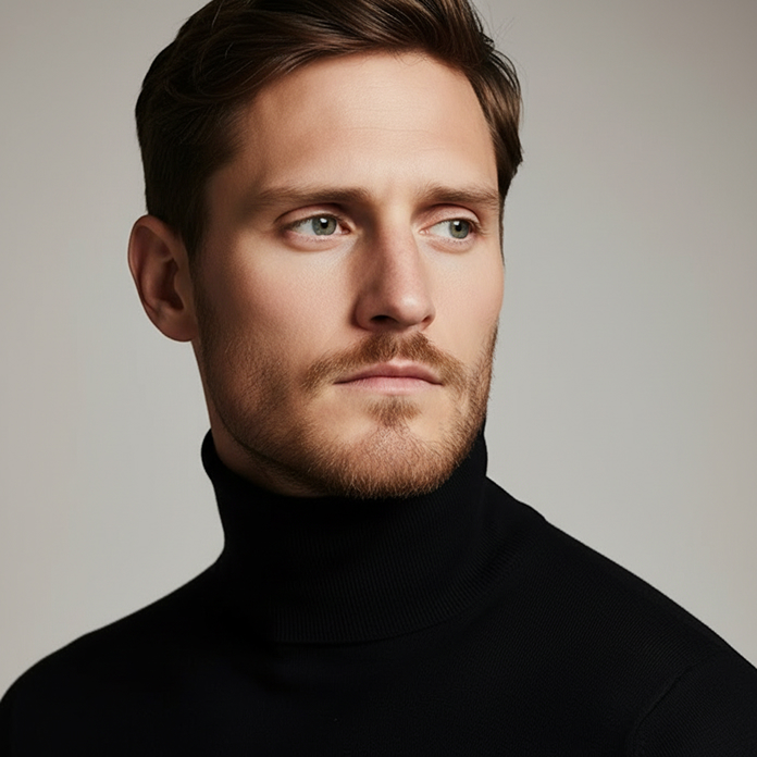
The most reliable headshot backgrounds are solid colours that provide clear luminosity contrast with the subject's face. Medium grey (around #808080 in RGB terms) is the most universally flattering solid colour background for headshots — it provides clear separation from most skin tones, reads as neutral and professional, and doesn't carry any cultural or emotional associations. Light grey works well for darker complexions; medium to dark grey works well for lighter complexions. Off-white is the second most reliable option — clean, professional, and flattering for medium to darker skin tones. Pure white is riskier: it can create harsh edge contrast, look clinical, and cause halation (a glowing edge effect) around light hair. Charcoal and dark navy work well for lighter complexions and add authority to the headshot.
A blurred environmental background — a softly focused office, building exterior, garden, or cityscape — can work well in headshots when executed correctly. The requirements: the blur must be sufficient that individual elements are not recognisable (bokeh depth), the environment must read as professional or at least neutral (not a home couch, not a restaurant, not a casual outdoor setting), and there must be sufficient luminosity contrast between the face and the background. A blurred glass facade, a softly defocused corridor, or a garden in soft focus all work. A blurred home office with recognisable items, a restaurant interior, or a party environment don't work for professional headshots. Bokeh backgrounds that are too similar in tone to the subject's skin or clothing create camouflage — the face doesn't separate clearly.
Five background types consistently produce poor headshot results. First: busy, unblurred environments — furniture, objects, or people behind the subject compete for attention and make the face hard to locate at small sizes. Second: patterns — wallpaper, fabric, or architectural patterns behind the subject create visual noise that competes with facial features. Third: windows or light sources behind the subject — creates silhouetting (subject underexposed, background overexposed). Fourth: backgrounds the same colour as the subject's clothing — the person blends into the background. Fifth: branded or text-covered backgrounds — company logos or event signage create a dated, event-documentation look rather than a professional headshot.
The most technically important consideration in background choice is luminosity contrast — the difference in brightness between the face and the background. Research on visual saliency shows that faces register faster and more accurately when there is clear contrast between face and background. This matters most at small display sizes: LinkedIn's 48px notification thumbnail, Instagram's 32px circular crop, and the small comment attribution photos used across every platform. At 32px, a face against a similar-toned background becomes a blur. A face against a clearly contrasting background remains recognisable. ThePortraitOS selects background tone automatically based on your skin colouring to ensure optimal contrast at all LinkedIn and Instagram display sizes.
Common questions
Medium grey is the most universally reliable choice — it provides clear contrast against most skin tones, reads as neutral and professional, and doesn't compete with the face. Off-white is the second most reliable option. Avoid pure white (too clinical), busy patterns, and backgrounds that are similar in tone to your skin or clothing.
Yes, if the background is sufficiently blurred that individual elements are not recognisable, and if the overall environment reads as professional. A blurred glass facade, office corridor, or architectural exterior works. A home living room, restaurant, or casual outdoor environment doesn't work for most professional headshot contexts.
Grey is generally better than white for LinkedIn. White backgrounds can create harsh contrast and a clinical appearance. Medium to dark grey provides better contrast against most skin tones and reads as more professionally grounded. ThePortraitOS selects background tone automatically to optimise contrast for your specific colouring.
Yes. ThePortraitOS generates a completely new background as part of the portrait generation process — your source selfie background is not used. The AI selects a professional background tone calibrated to provide optimal contrast against your specific skin tone. The result is a cleanly lit portrait against an appropriate professional background.
Start now
ThePortraitOS generates a professional background automatically calibrated to your colouring. No studio setup needed — upload one selfie, first portrait free.